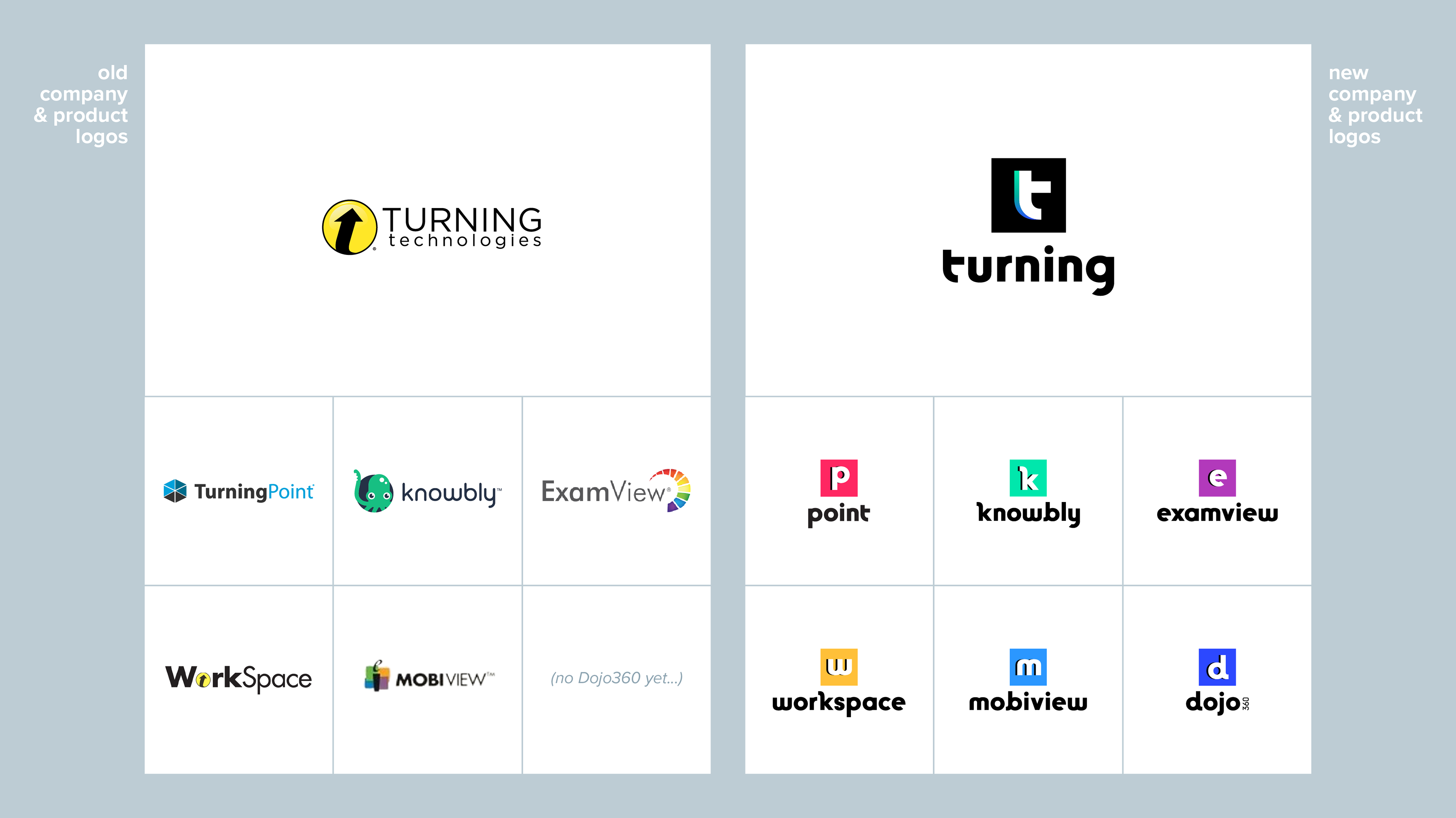
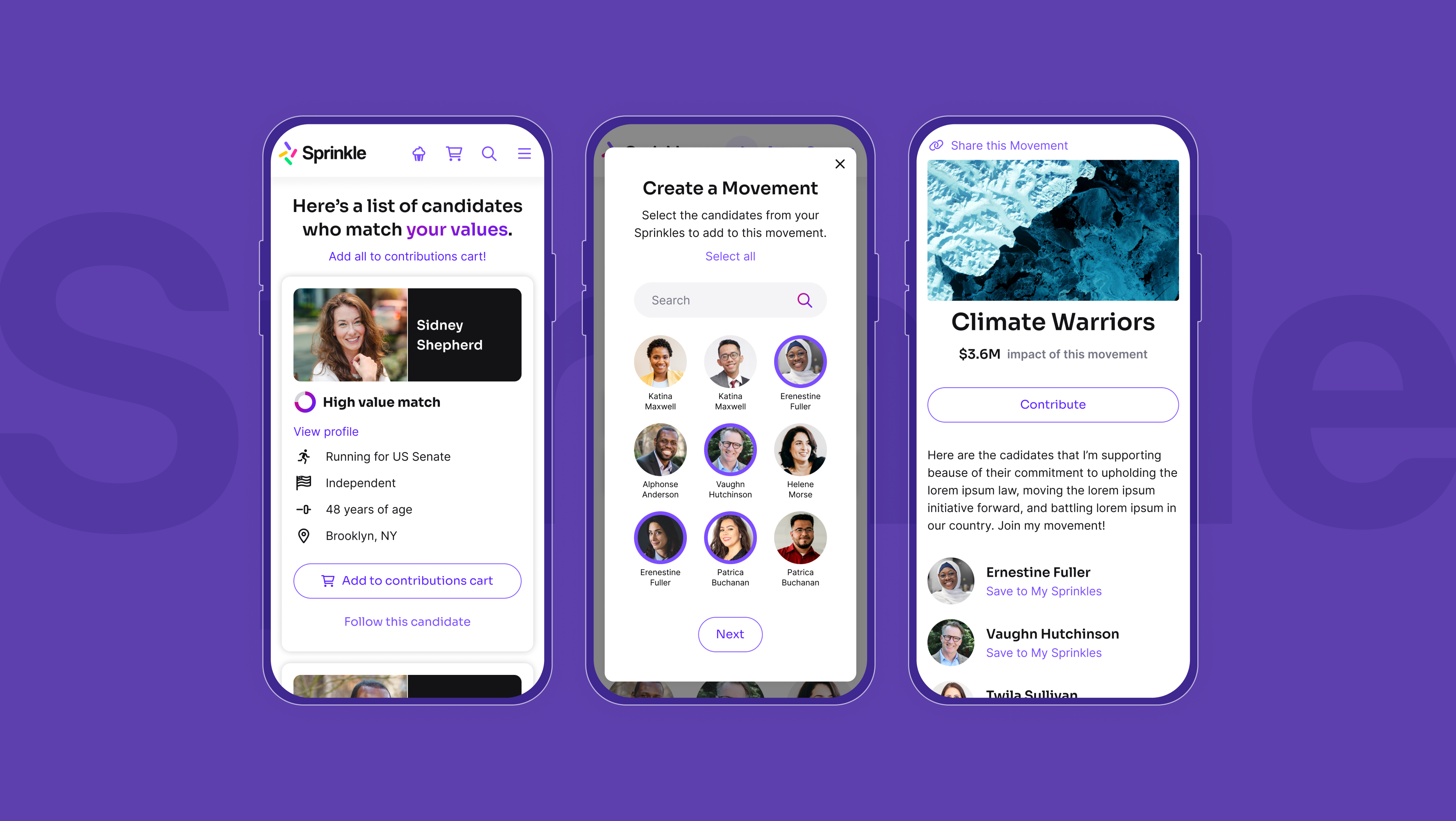
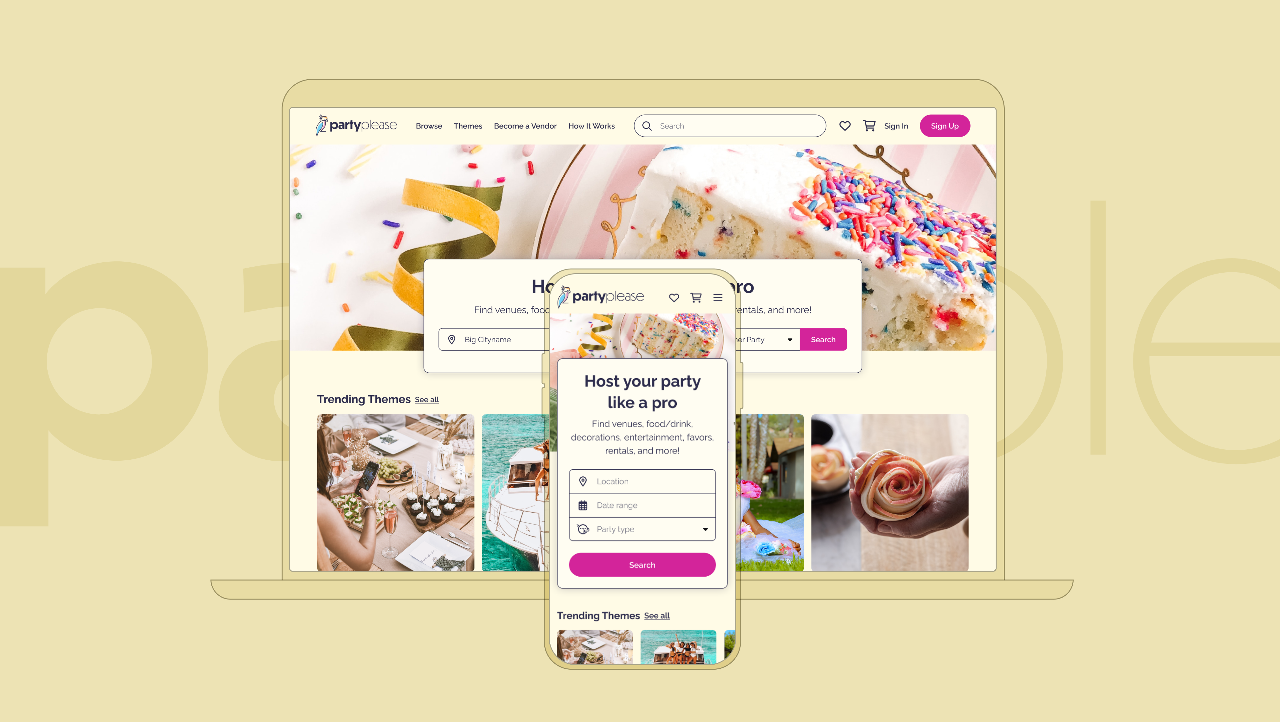
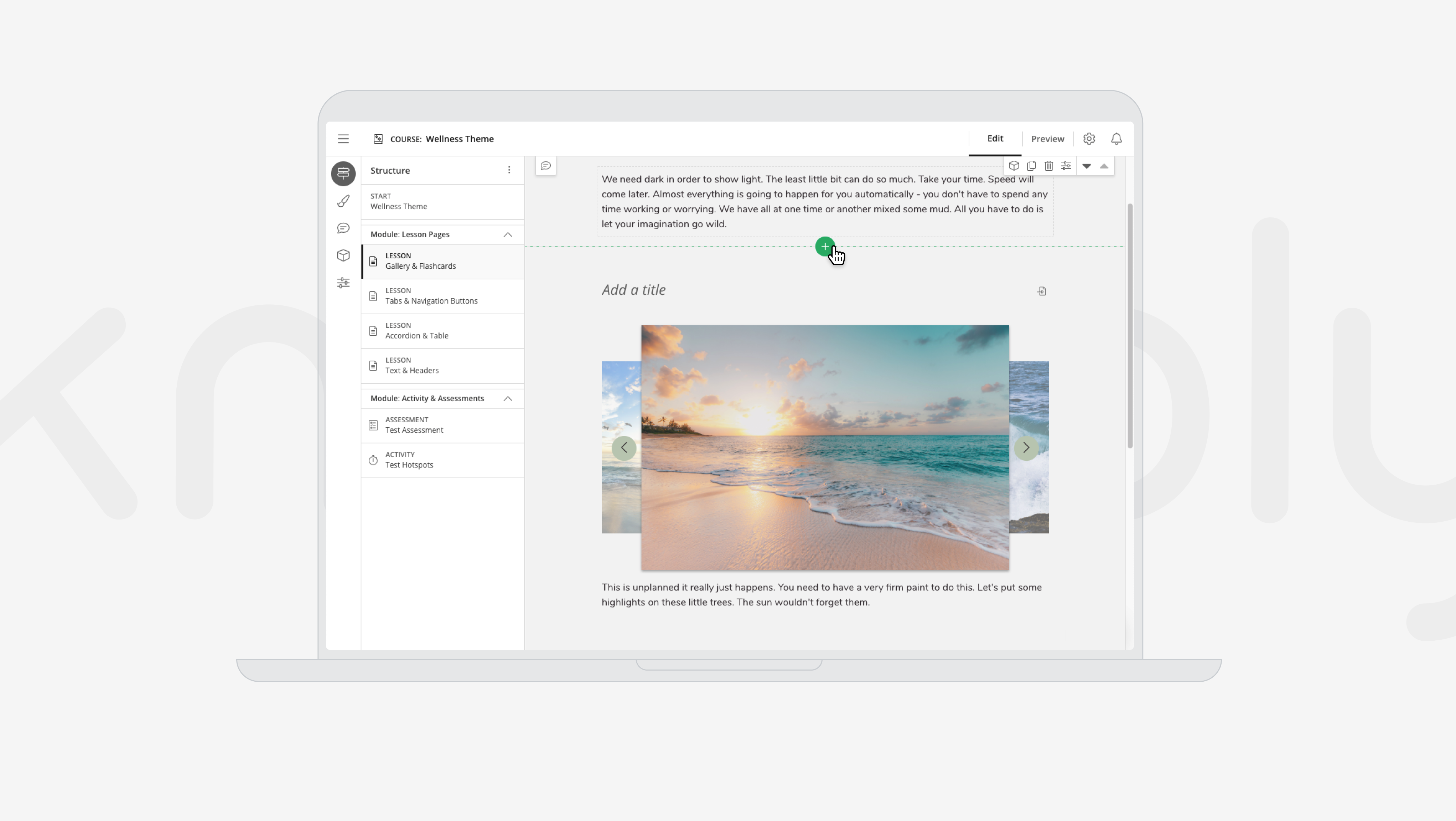
Turning (now Echo360) was an edtech company with a suite of six hybrid learning and engagement products that support collaboration, retention, and connection between instructors and learners. Turning wanted to modernize it's brand, update their corporate and product logos, and bring its products together with a cohesive and scalable design pattern that could accommodate new products as the company grew.
My role in it. Art direction, visual design.
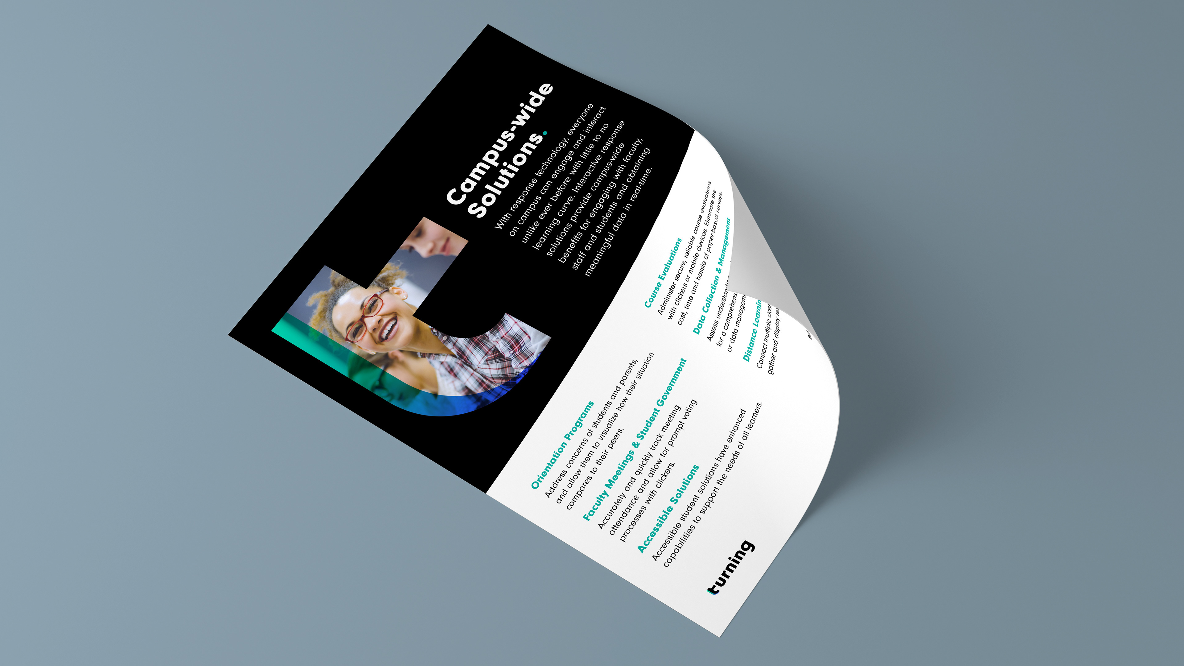
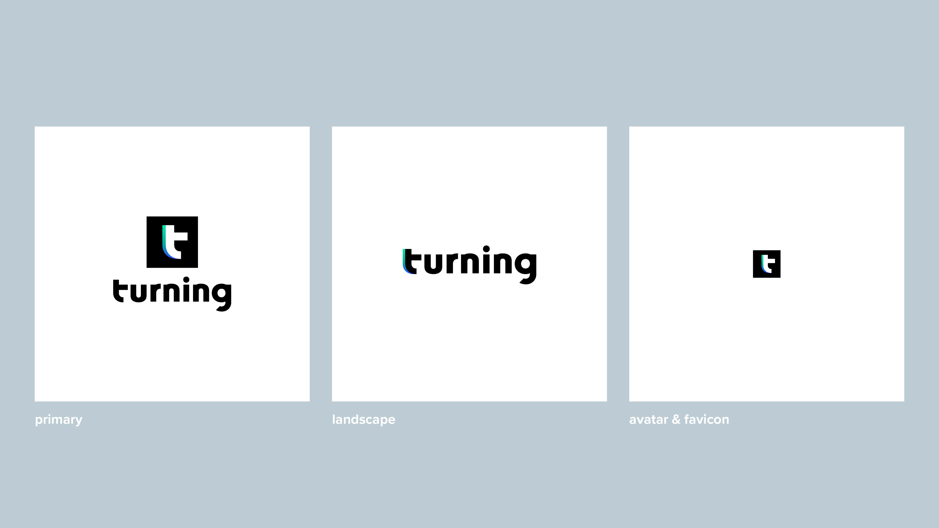
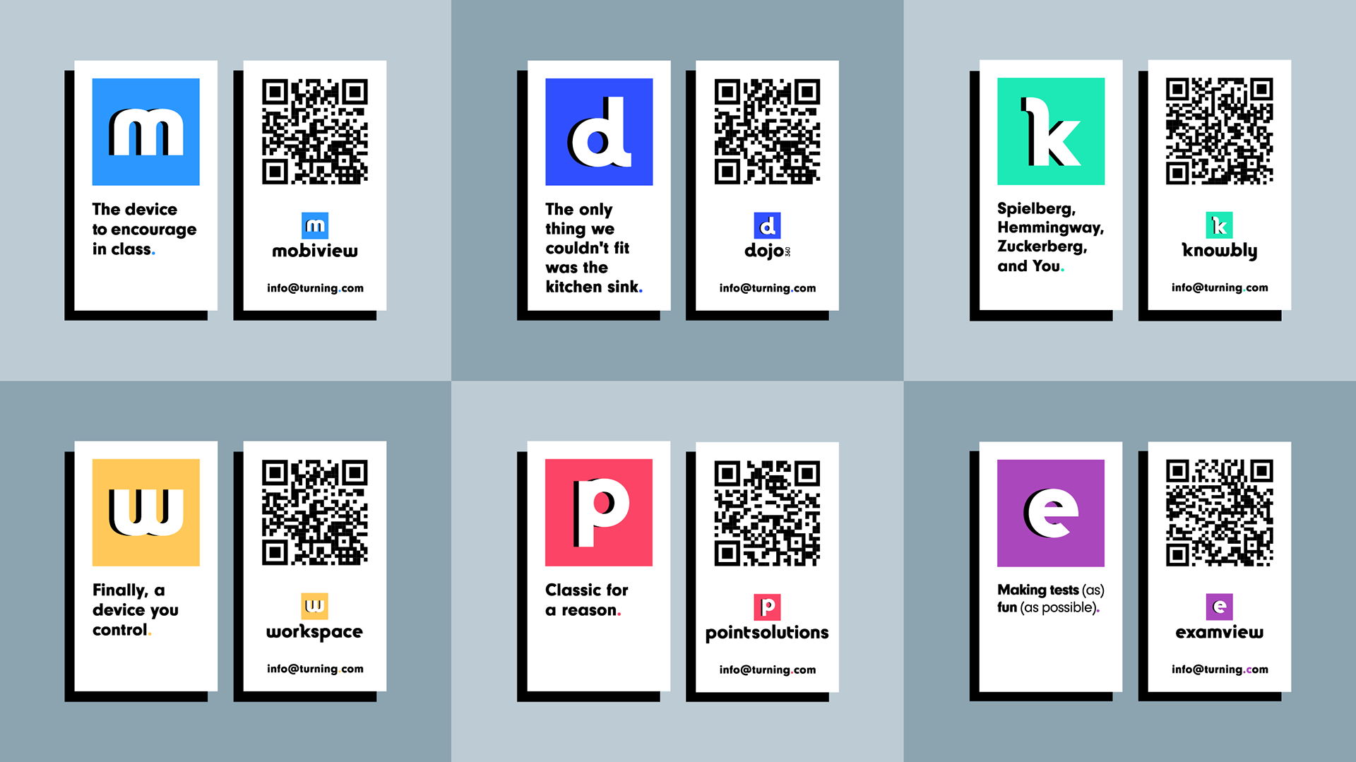
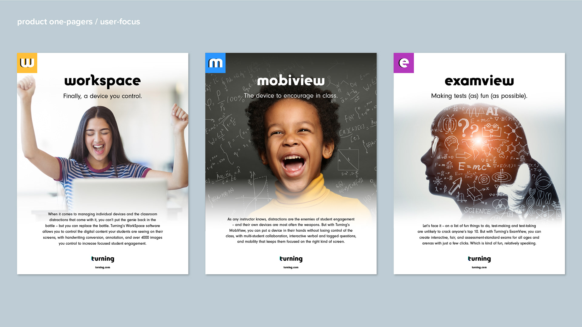
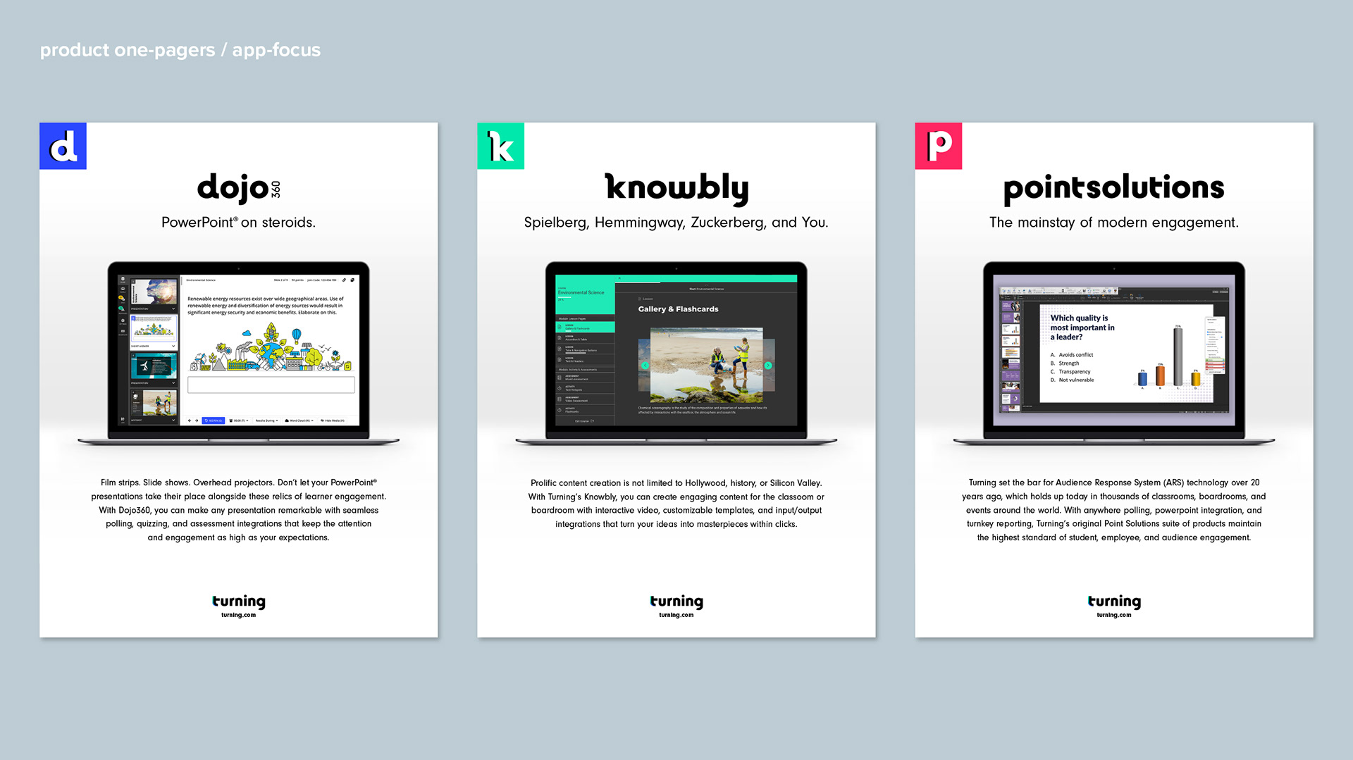
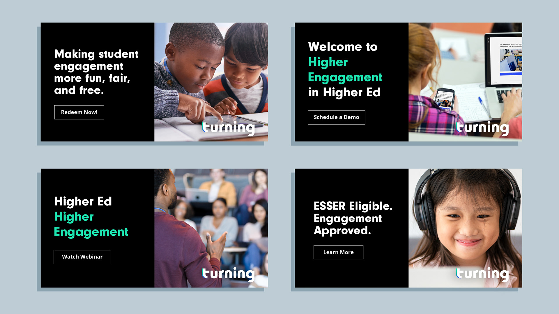
A bit about the visuals. Inspiration for the brand centered on the premise that knowledge should be easily accessible, that engagement is key to comprehension, and that achieving learning goals is joyful for both learners and instructors. To convey this sentiment I created a palette of happy, bright colors paired with rich, accessible blacks and grays. Using this palette, I created a modern tiled logo pattern for Turning’s products, each assigned its own distinct primary color for its mark and eventual product UI. I used a fluid gradient in the corporate logo to suggest smooth and seamless transitions among Turning’s offerings, as well as to set hierarchy and differentiate it from the product logos. Imagery for Turning’s collateral incorporates joyful students at that ‘aha’ moment, communicating that Turning products not only makes learning accessible and achievable, but also quite joyful.
The tools I used. Illustrator, Photoshop, InDesign.
My employer. Turning.
